E-Commerce Redesign
Project Overview
Embarking on a transformative journey, my mission was to reimagine the digital storefront of a small business. Amidst a sea of choices, I set my sights on The Budget Mom, not just as a project but as a heartfelt choice. The Budget Mom, is a small business committed to financial empowerment and savvy budgeting.
My Role: Lead UX/UI Designer, Project Manager
Duration: 3 weeks - September 2023
Project type: Academic, Conceptual, E-Commerce
Tools: Figma, Figjam, Google Drive, Zoom, Slack
Research Objective
My goal was to delve into the user experience terrain, aiming to validate my hunch that the current website might pose challenges and lack the navigational ease that users crave. This exploration isn't just about uncovering flaws; it's a journey to understand the user's perspective intimately, fostering a connection that goes beyond data points and statistics.
User Interviews & Usability Testing
I needed users who preferred alternate methods to budgeting apps such as the ritual of jotting down finances on paper— aligning with The Budget Mom's methods.
In assembling my interviewees, I aimed for a diverse ensemble of established and new users. I wanted to ensure that the insights gathered reflected an authentic narrative of user interactions.
View user guide here
What did I find?
My hypothesis was confirmed:
1) Users needed their navigation in an intuitive location.
2)Users needed a meaningful labeling and consist system.
Competitive & Comparative Analysis
As a financial guru, Dave Ramsey's digital domain served as a benchmark for best practices in information architecture. I wanted to dissect and understand the nuances of effective information organization. These insights helped inform and elevate The Budget Mom's digital landscape, aligning it more closely with the standards set by a seasoned financial authority.
View Analysis here
In the vibrant world of fashion and lifestyle, Kate Spade stands as a beacon of diverse product offerings. The focal point was understanding the intricacies of filter hierarchy and effective filtering. The goal was to create a digital space that not only showcases products but does so in a way that resonates with the user's experience for simplicity and clarity.
What did my research tell me?
A store front navigation was needed
Optimizing category hierarchy
ONE website: TWO user goals
What product did they want?
What form (physical or digital)did they want it in?
Let’s put it into perspective, our persona
Victoria needs an easy and intuitive labeling system
& web navigation to have a pleasant shopping experience.
HMW...create a storefront experience?
HMW...ensure consistent and clear product labeling across all categories to avoid confusion for new and established users
HMW...enhance the websites navigation to make it more intuitive and user-friendly to reduce the time it takes for customers to find a product
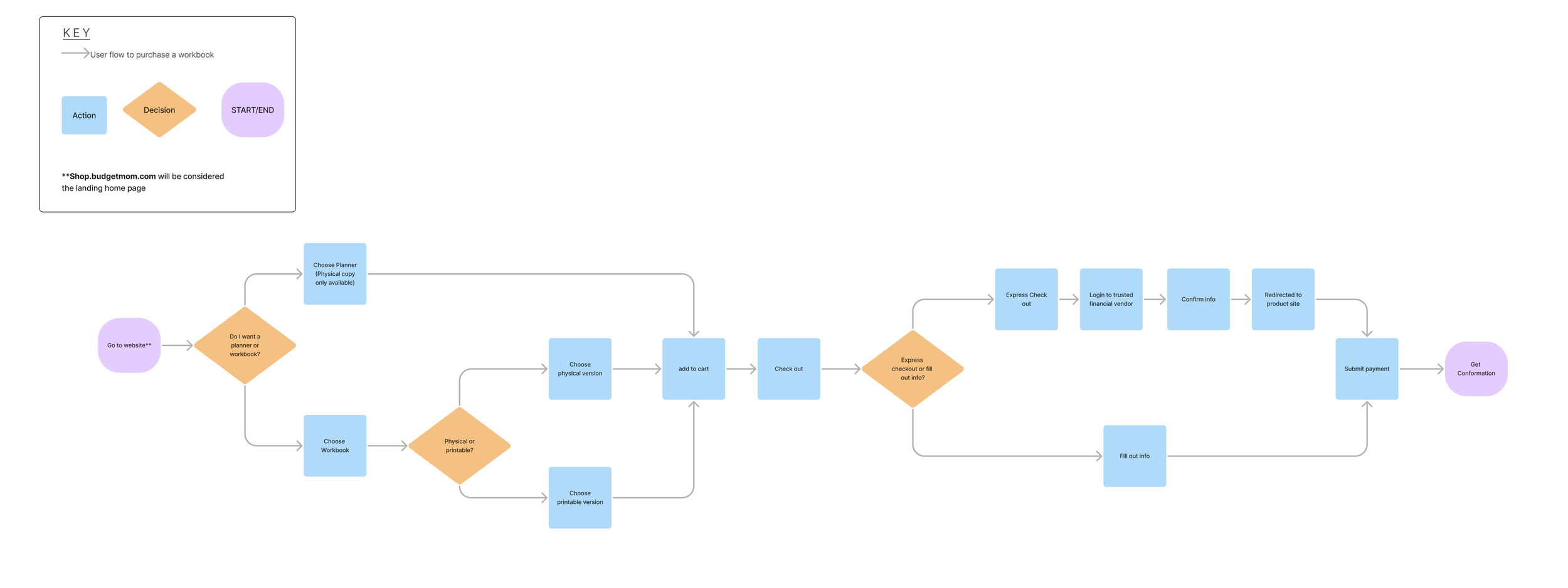
User flow of existing website
(2)
(1)
I noticed TWO critical decision points:
1) What main product did users want? Planner vs. Workbook
2) What form did they want it in? Physical vs. Electronic
Sketching Wireframe
Current hamburger menu
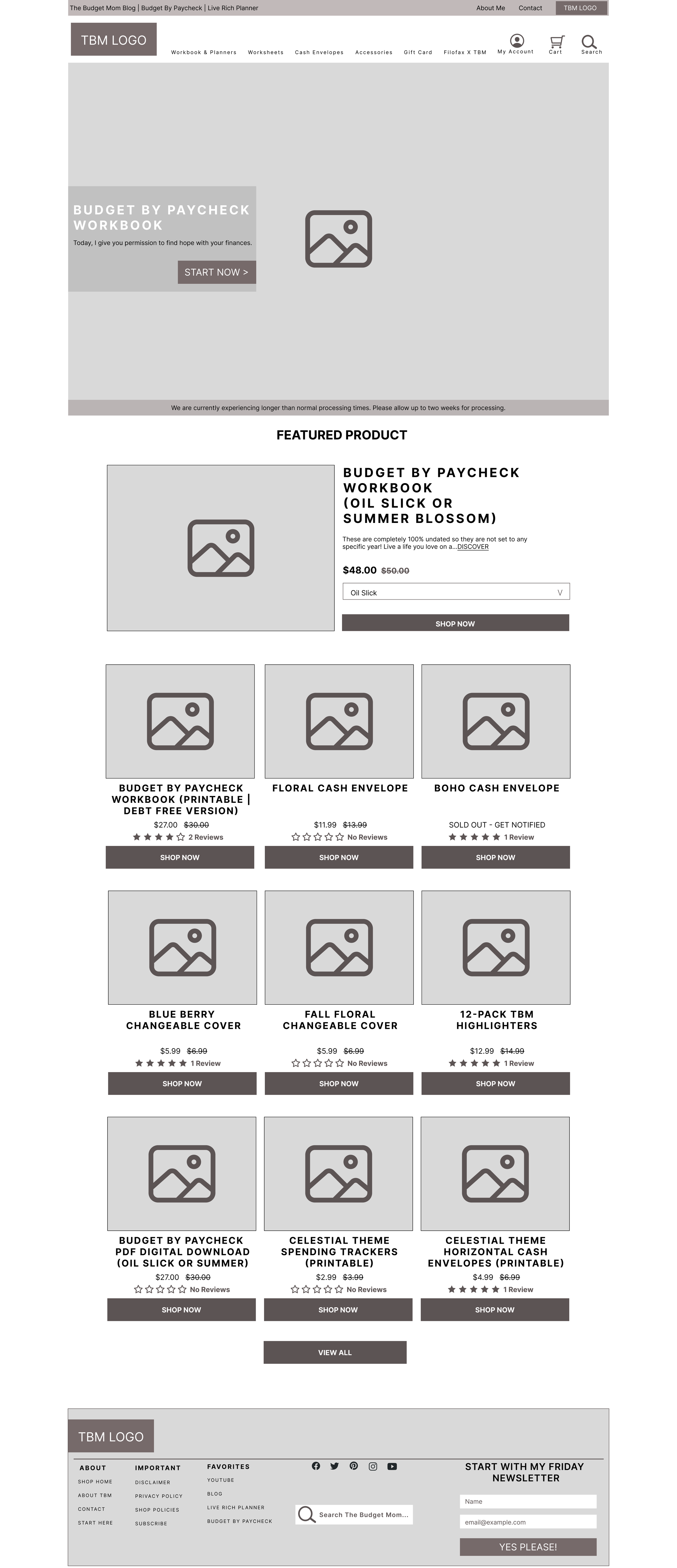
Landing page
(1)
(2)
Initial Sketch
I pulled the hamburger menu out and created a global navigation.
I created a toggle button showing which items were could be printed.
If its not broken, dont fix it:
additional critical screens
Detailed product page
(2)
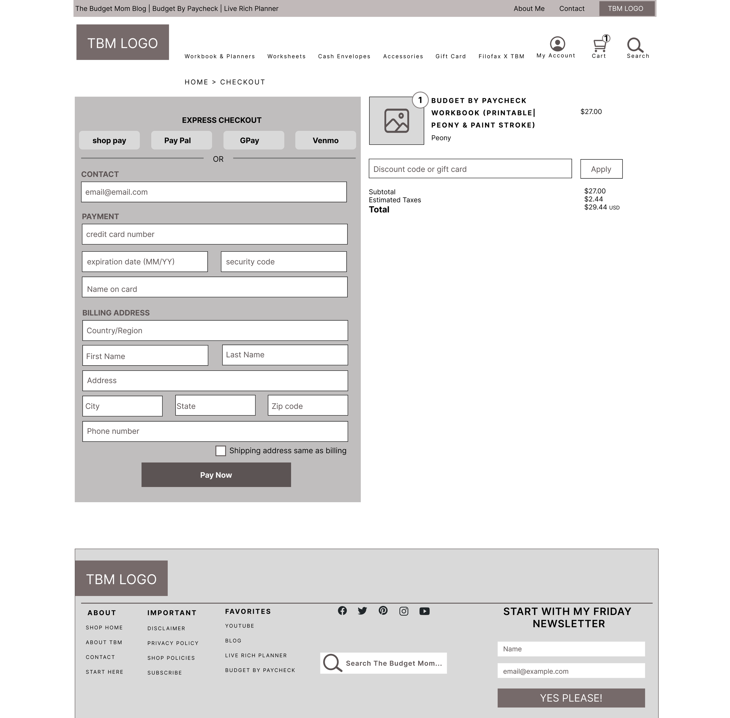
Mid-fidelity interpretation
Checkout page
(1)
How useful was my design change? Let’s test it out!
TASK:
Find Workbook printable version
Add to cart
Check out
FINDINGS:
4/4 users STILL found “printable” confusing as a filter descriptor
3/4 users found global navigation helpful
View my prototype
Next steps
Card sort to find which term users associate with an electronic product.
Explore user journey and interviews with existing users.
Add images of what product looks like on the inside per user feedback.
Add social media presence to increase engagement and community.
Retroactive Lessons:
What went well
Explored and used different research methods to obtain user insight.
Pushed myself with my design
Room to grow
Have better project management.
Ask more precise during user interviews questions .

