Kindle Companion App: Enhancing User Experience through Innovative Feature Design
Sharing the Joy of Reading—A Conceptual Design that Allows Book Lovers to Connect to Their Favorite Reads and Each Other.
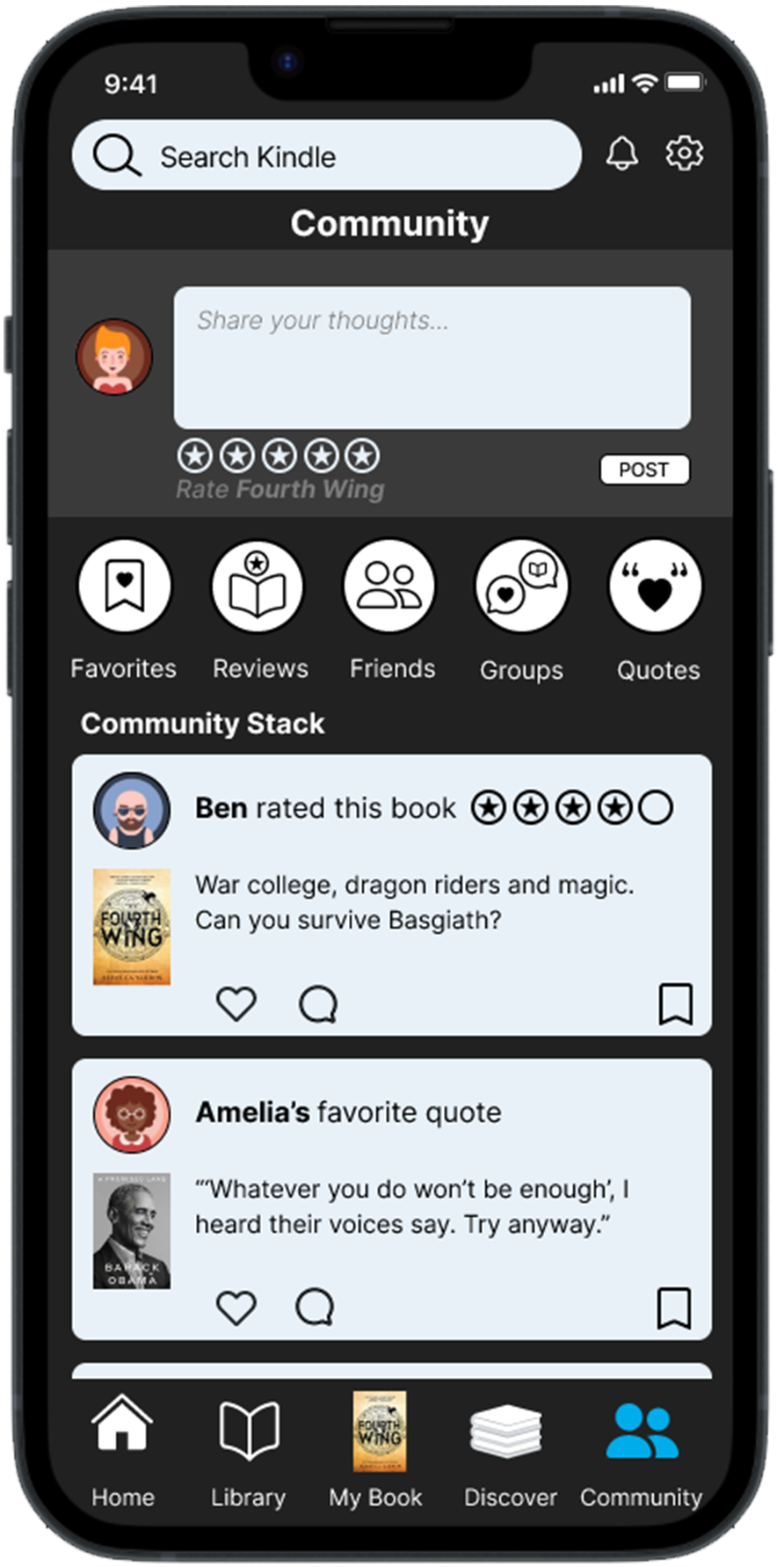
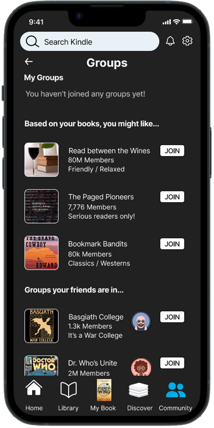
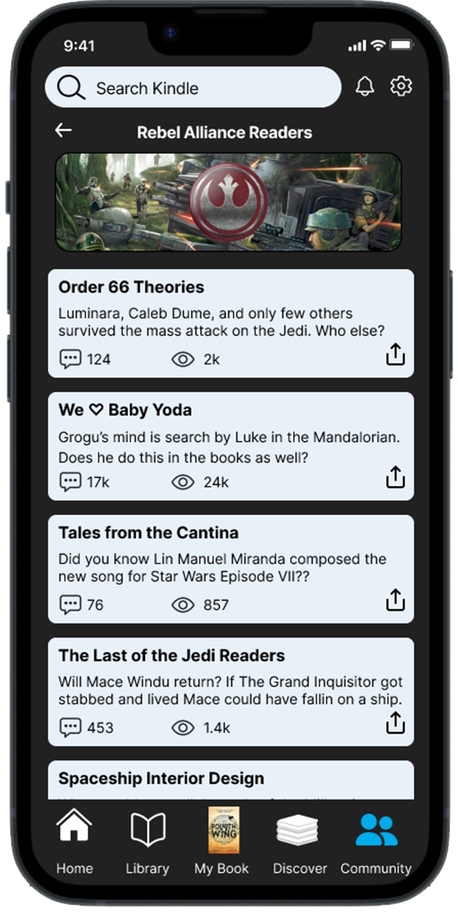
Final prototype of critical screens: Community, Group and Discussion pages.
My Role: UX Design, User Research, Usability testing
Team: Jon Cooper, Devon Bower
Duration: 3 weeks - October 2023
Project type: Academic, Conceptual, Mobile application
Tools: Figma, Figjam, Google Drive, Zoom, Slack
In the realm of digital books, Amazon's Kindle stands out as a pioneer, leveraging innovative e-ink technology and a lightweight design to surpass competitors. Our group embarked on a compelling challenge: to envision Kindle not only as a premier reading platform but also as the go-to space for sharing progress and reflections, fostering connections among avid book lovers.
Project Overview
Kindle Reader vs. Companion App
The initial phase was pivotal in shaping our direction: deciding to prioritizing the development of the companion app over the Kindle device itself. We recognized that the companion app presented a more fertile ground for cultivating social features, capitalizing on user behaviors inclined towards increased engagement.
Our persona, Sally, in the process of being connected to a new reading community.
Mapping Social Connectivity: Understanding the Current Landscape
Our background research unveiled Amazon's purchase of Goodreads in 2013, a social cataloging site facilitating exploration of books, annotations, quotes, and reviews. Although the Kindle app incorporates Goodreads shelves displaying individual book statuses, users currently lack full access to Goodreads features within the app.
To address this gap, we propose seamlessly integrating a social platform into the Kindle companion app. This initiative aims to transform Kindle into a vibrant hub, fostering a community of literary enthusiasts who can share their journeys and insights.
Exploring How Readers Share and Connect
We conducted a comprehensive research to gain valuable insights into the experiences of Kindle users. Our primary research objectives were to understand current user sentiments towards the product and explore the habits that define their interactions within the digital community. To achieve this, we engaged in a series of in-depth interviews, collecting firsthand insights directly from Kindle users. Read user guide here.
I interviewed 2 of the 6 users and we found the following insights:
“I like engaging with people I have relationships with in real life.”
“I favor visually engaging content.”
“I value intuitive design.”
“I like to connect with people on a topic we’re all familiar with.”
“I appreciate recommendations tailored to my reading history.”
Our research yielded a compelling discovery: Kindle users expressed a strong desire for a way to share their reading experiences with friends and their wider community. Beyond a solitary reading journey, users yearned for a means to engage with fellow book lovers directly. This revelation sets the stage for a pivotal design challenge: how to seamlessly integrate social features into the Kindle app without compromising the core reading experience.
We thought about how we might…
…help readers connect with friends and other kindle users?
…allow users to share reading milestones?
…make existing features more intuitive to users?
…inspire users to find and join groups?
Our bookworm, Sally
Our attention honed in on the user's journey as they embark on joining a group, discovering relevant discussion topics, and actively participating by leaving comments. To map out this anticipated user interaction, we crafted a user flow diagram. This visual representation is the happy path we anticipate users navigating through these key actions.
What steps will Sally take?
User flow of finding a group, discussion forum, & leaving a comment
Independent sketches & Design studio
Users expressed various forms of content they enjoyed to use around reading. Read their responses here. We each drew out our vision of the app separately and then came together to review our designs. We picked the best elements to reflect user needs.
How user insight inspired our designs
Mid-fidelity Prototype
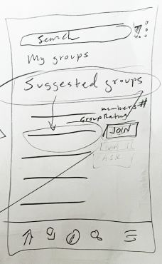
Sketch
Landing Page
We wanted the design to be familiar to what users already know on the home page. It was important for us to NOT deviate from the primary use of the Kindle app: Reading!
Social Page
My focus was to create a sub landing page for the social page. I wanted to have elements users were familiar with from other social apps: a feed with updates from their friends or who they follow, a comment box to allow posting and icons navigating to other parts of the social pages.
Group Page
While some users enjoyed short form content, others enjoyed long form content. Here users can view and choose groups they what to participate in based on their previous reading history or they can view groups their friends are apart of.
Discussion Groups & Commenting
Some users enjoyed engaging in social content while others preferred to observed. Once users join a group, they will be able to actively participate in discussion or passively view insights.
Let’s test our design!
Task #1 Adding a Book to Favorites (based on a friend's review):
Explore how users navigate and engage with the social aspect of recommending and favoriting books based on peer reviews.
Task #2 Finding a Group, Discussion Topic, and Leaving a Comment:
Assess the ease with which users can discover and join groups, explore discussion topics, and actively participate by leaving comments.
As we moved into the usability testing, our primary objective was to validate our design hypothesis and assess the functionality and user-friendliness of our envisioned social page. We presented our users with two specific tasks to simulate real-world interactions within the Kindle app:
What a shock! Usability results show designs were not as intuitive as we thought.
100% of users did not know where this comment would be posted.
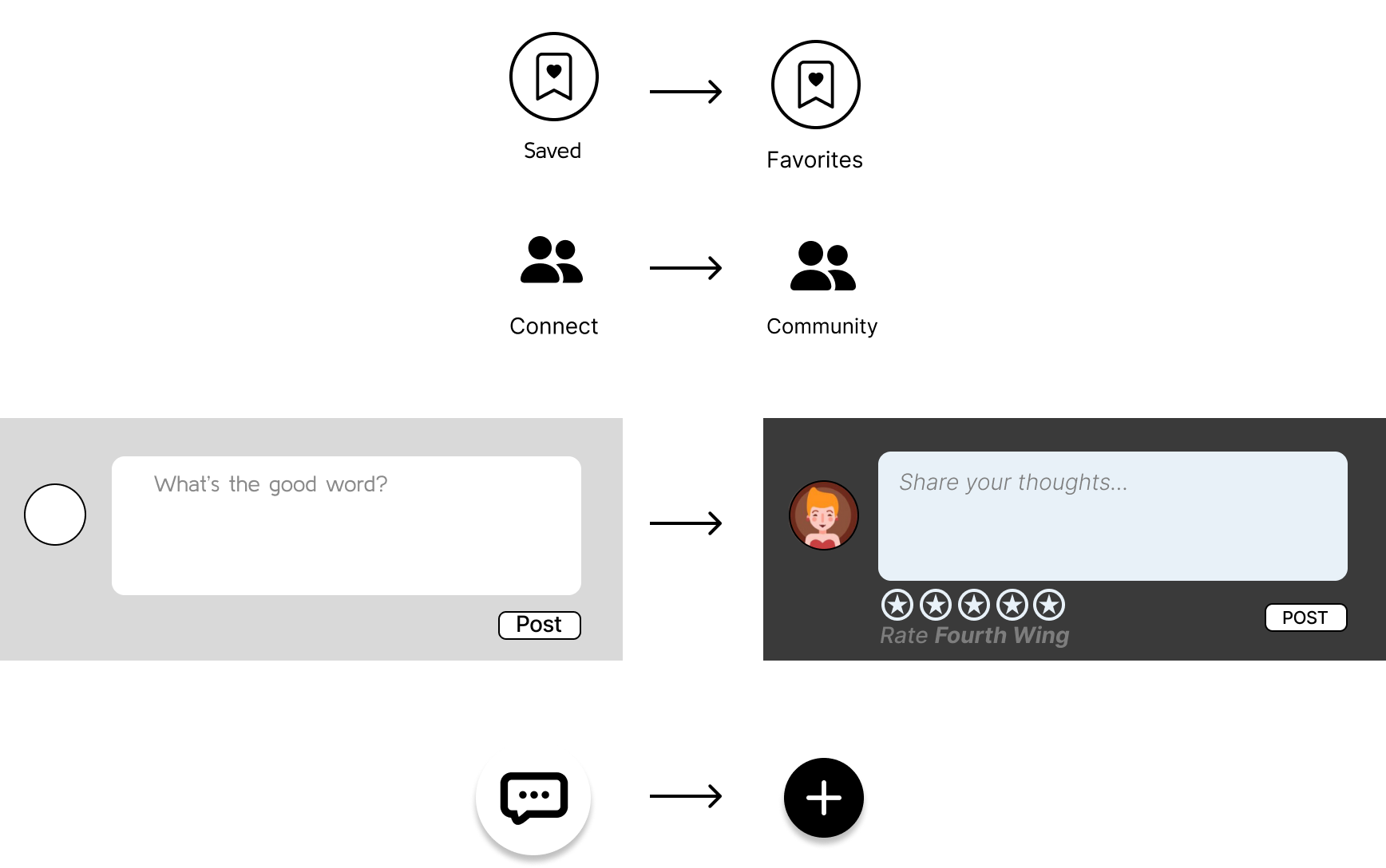
3 of 5 users did not see or understand the function of the “saved” icon.
2 of 5 users recognized this icon as a chat feature instead of our intent to leave a new comment.
Users felt “Connect” did not fully describe what could be done here.
How user feedback influenced our design
We changed the Saved Icon to Favorites. This better describes the location of where the books that you would like to read would go.
We changed Connect to Community to further express our goal of adding the social feature.
We added more detail to the comment box to inform users what the box was meant for: Rating your current books, sharing book thoughts and current reads.
Lastly, we changed the icon from a 'conversation' bubble to a "+" icon to more easily identify users who can add a comment.
Light Mode Vs. Dark Mode: Users loved the dark e-ink technology of the Kindle reader so for our final design, we chose a dark mode pallet.
Click through our prototype
Next steps:
Chat feature: Allow members to send direct messages.
Posting Quotes: Saving and posting quotes from their favorite books to share with the community.
Likes and Sharing: Interact with friends by liking their post, sharing books and favorites with friends.
Usability testing Hi-fi prototype to find if changes made to previous user feedback was successful
Retroactive Lessons:
What went well
Laugh a little: We have a shared goal, we’re human, we all want this project to succeed.
Continuing to ask for everyone’s input to make sure we are all heard.
Doing independent research and coming together later to collaborate on our findings.
Divide and conquer the work during design studio.
Creating comradery.
Room to grow
Not overthinking and dwelling the little details.
